If you had the same high school science class I did, you learned that light waves are not actually colored—the objects we see appear to our brains to be the color that they reflect, and not the color they absorb. So a green plant absorbs all of the red and blue light waves, and reflects all of the green light. (I always found that hard to keep straight because it is so “inside out” from how it seems intuitively.) But knowing that visible light is made up of red, green and blue (RGB) is an important base to understanding color in general.
Probably more important to understand in the “real world,” though, are color effect and color complementarity.
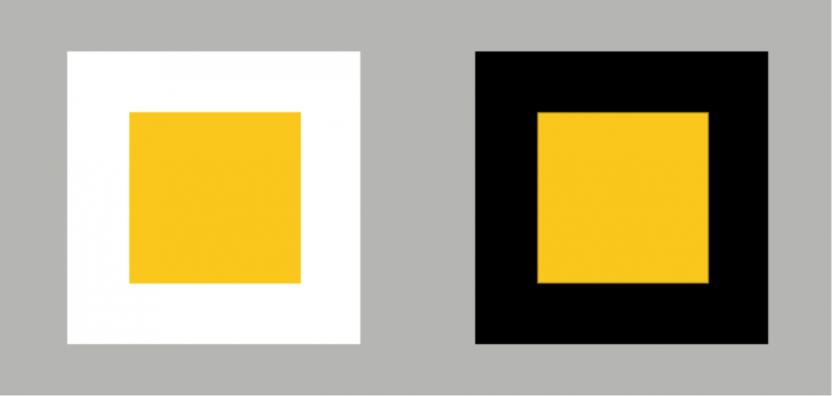
Color effect is how a color is perceived, as affected by its environment—what it is next to. In this example, the same yellow square looks darker and warmer with a white background, and more brilliant and colder with a black background.
Color complementarity is more complex. Basically, it means that if you mix two colors from the opposite side of the color wheel, you will get a neutral gray. And most importantly, when you juxtapose two complementary colors, you get an afterimage effect as in the famous Jasper Johns American flag painting.

If you stare at the small dot in the center of the flag for 30 seconds or more, then look away at a white surface, you should see an after image of the United State flag in its usual (complementary) colors.
Complementary contrast. In The Elements of Color, Johannes Itten explains the afterimage property of this type of contrast, already described above, by saying, “The eye requires any given color to be balanced by its complementary, and will spontaneously generate the latter if it is not present.” Complementary colors also can make the viewer see color vibration—literally, the two colors seem to vibrate when near each other.
Making good color combinations
Basically, we are all trying to come up with good color combinations when we design something for print or Web. Often, the best combinations are based on some type of contrast, which allows the viewer to differentiate the colors easily. There are several types of contrast to work with:
Contrast of hue. Here is where complementary colors have the greatest contrast. If you need more than two colors, you can use three colors that form a triangle or four that form a square around the color wheel. Contrast of hue is found in the folk art of people everywhere.

Combining colors that are located at noncontiguous and evenly spaced locations around the color wheel is a good way to make sure they will look pleasing to the eye.
Light and dark contrast. Black and white are obvious examples here, but the same thing can be applied to other colors. This type of contrast is also called value, particularly in the world of Photoshop.
Cold and warm contrast. Red/orange is warm, while blue/green is cool. Research has shown that people will perceive rooms to be cold at different temperatures, depending on what color the room is painted (a blue-green room is thought cold at 59 degrees, while a red-orange room isn’t thought cold until it is 54 degrees). Remember, though, that color juxtaposition affects warmth and cold perception: a red-violet next to a blue will look warm, but the same red-violet next to red will look cool.
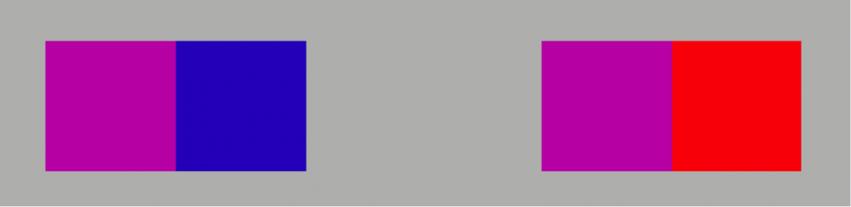
A red-violet juxtaposed to blue looks warm (left), while the same red-violet juxtaposed to red looks cool.
Also, there is a noticeable spacial effect that happens with red and blue—when side by side, red advances toward the viewer, while blue recedes.

The narrow red bars advance toward the viewer, while the cooler blue recedes.
Contrast of saturation. This is the degree of purity of the color, so it is possible to contrast a pure, intense color with a dull, diluted color. There are four ways to dilute a color:
- Tint (add white).
- Shade (add black).
- Add gray (heading toward neutrality)
- Add the complementary color
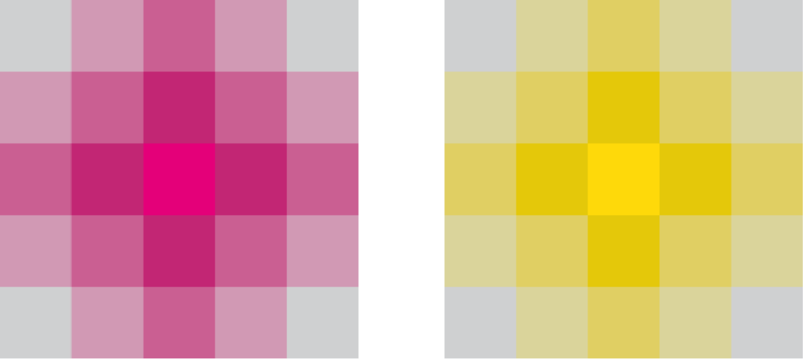
Adding gray to a pure color demonstrates one way color can be desaturated. The grays in the corners of each pattern are the same neutral gray.
Contrast of extension. This has to do with how you use the color—particularly how much of each color. Research has shown that different combinations of complementary colors become balanced when used in different proportions. Itten and other color theorists list those as shown in the following illustration.

*Contrast of extension requires these proportions of the complementary colors to achieve a harmonious or balanced amount of color:
3:1 for yellow to violet… 2:1 for blue to orange… 1:1 for red to green*
Varying the proportion greatly for these combinations results in a more expressive image, while maintaining these proportions gives you a harmonious, quiet, and possibly static image.
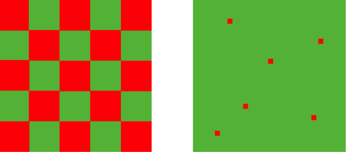
A red/green checkerboard pattern looks static compared to a green field sprinkled with small red squares, illustrating one way to manipulate contrast of extension.
Other color thoughts
Color can add to flow and sequence. It can tell the reader where to start, and what relates to what (such as when all the subheads are the same color, marking their level in the text hierarchy).
In two-color work, a little goes a long way. If you overuse it, it loses its effect.
Darker colors advance toward the viewer, while lighter ones recede because that’s how things look in our three-dimensional world (think of looking at close mountains vs. distant mountains that fade from view).
With type, color combinations need to be kept legible. Think of how road signs are colored—black and white, black and yellow, red and white, blue and white. Remember this when choosing a paper color, or the background color of a website. The older we get, the more contrast we need for readability.
Colors have a host of connotations, whether cultural or idiosyncratic. Be aware that your own personal or cultural interpretation may not match that of your audience!
Finally
Color is an essential part of successful design. It attracts and holds attention, conveys information, and makes the information memorable.
Learning more about how it works is one of the keys to getting your message out!
Based on the book The Elements of Color by Johannes Itten.