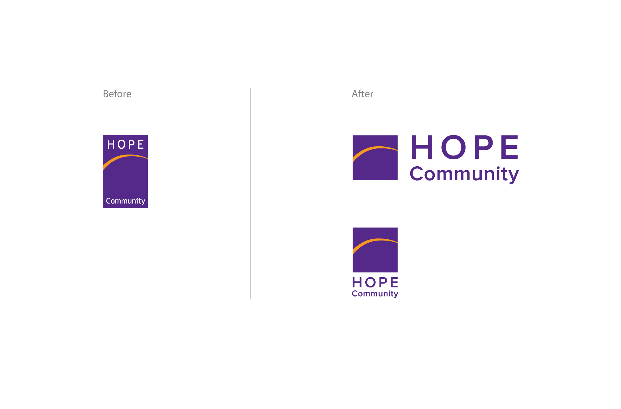
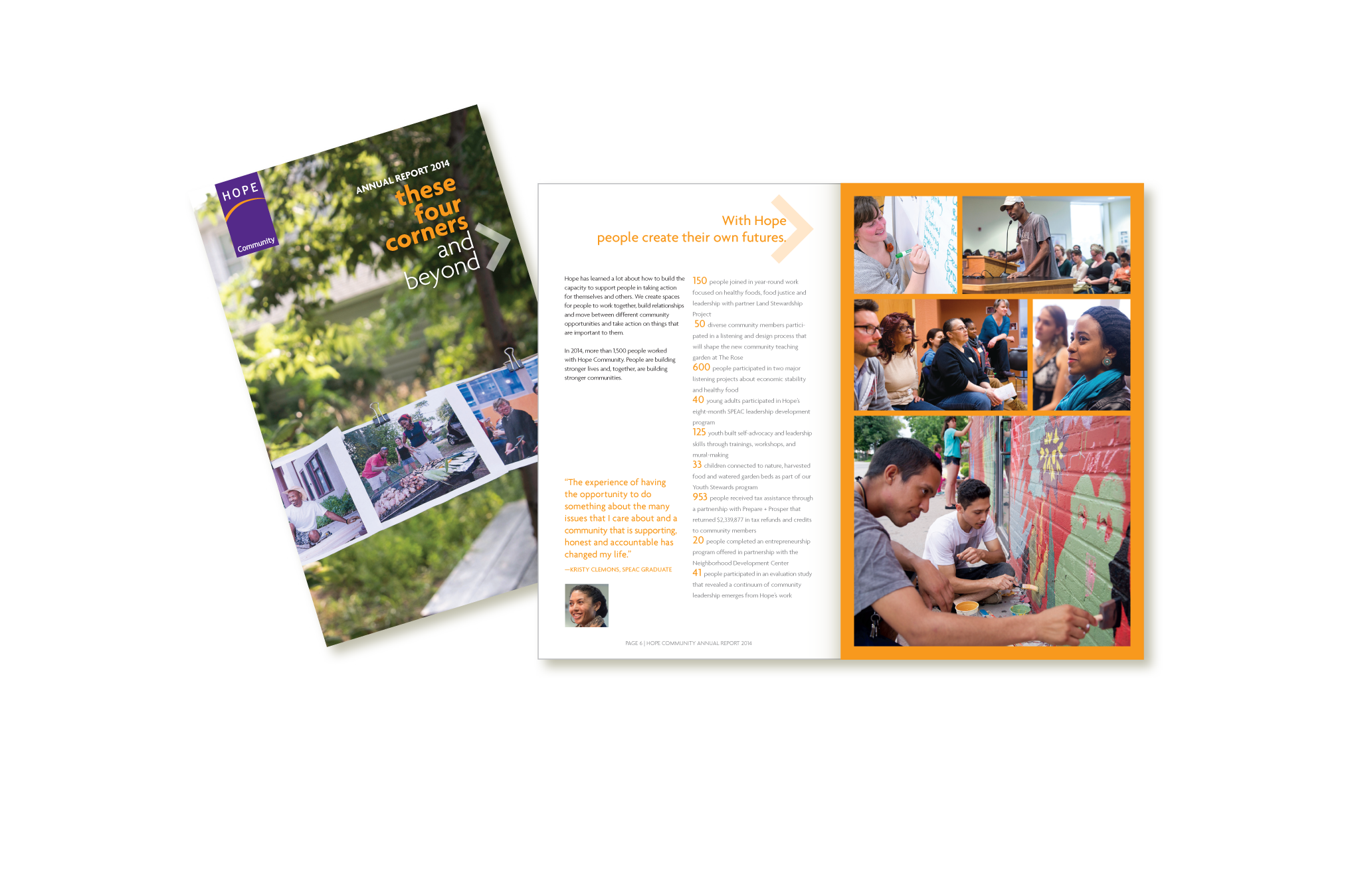
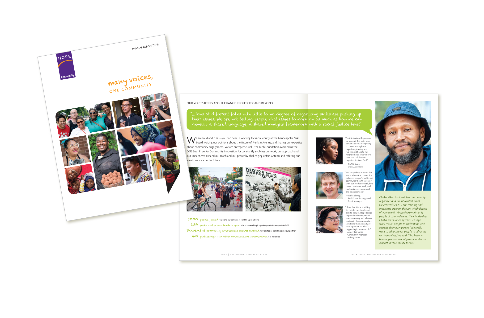
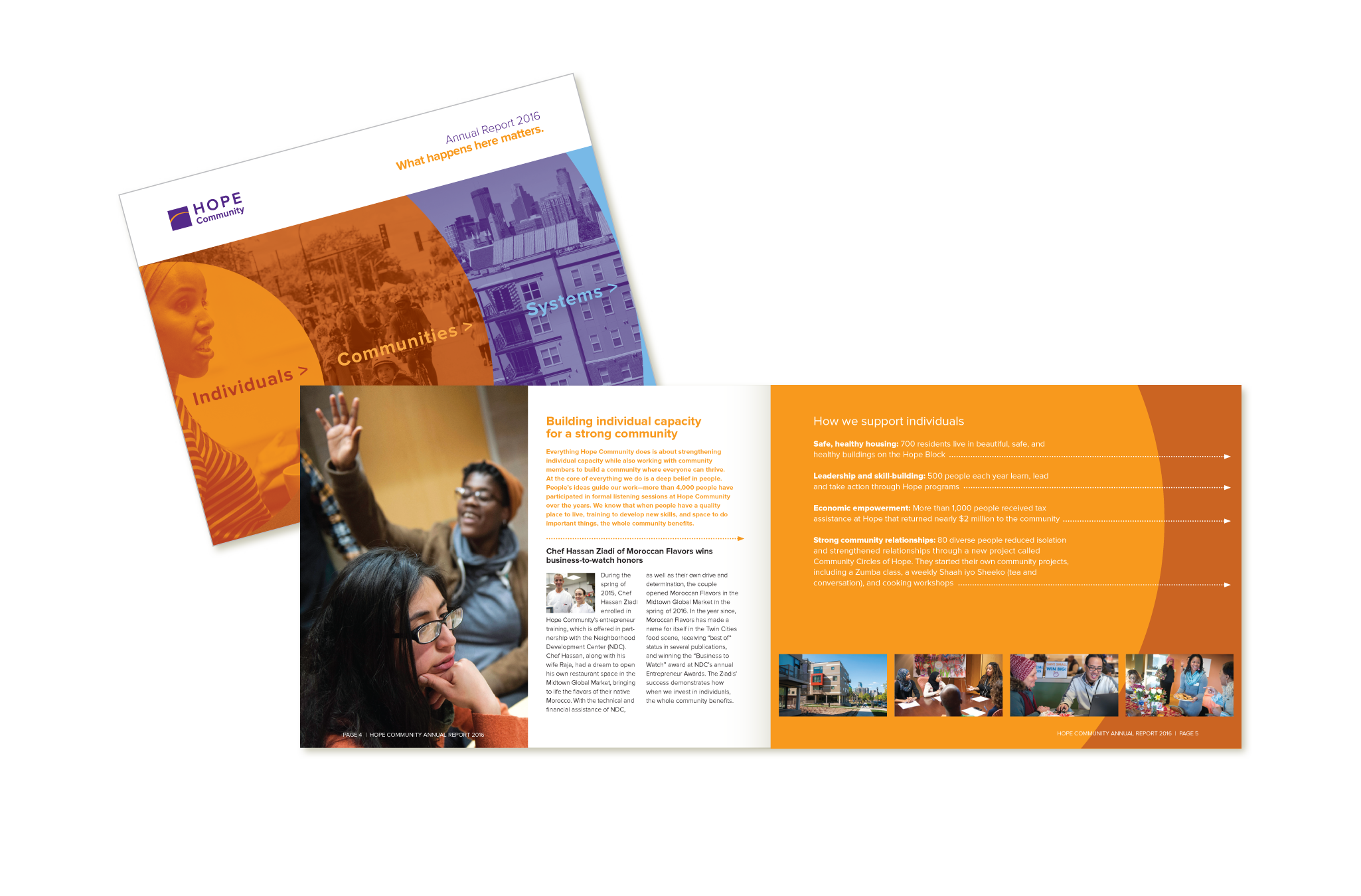
After years of collaborating with Hope to create communications collateral they asked us to work with them to update their logo for their 40th Anniversary year. Initially, they wanted to retain the original design while ading a 40th Anniversary announcement. After a number of discussions and review of some exploratory sketches we agreed to create an updated logo that incoporates the existing colors and "arc" graphic. But, we saw an opportunity to make the name more prominent. With that change in layout and a new font the logo can now be used more flexibly and at much smaller sizes while retaining enhanced readability of the name. We identifed a new family of brand fonts and have built out the color palette with new hues that complement the original purple and orange colors.
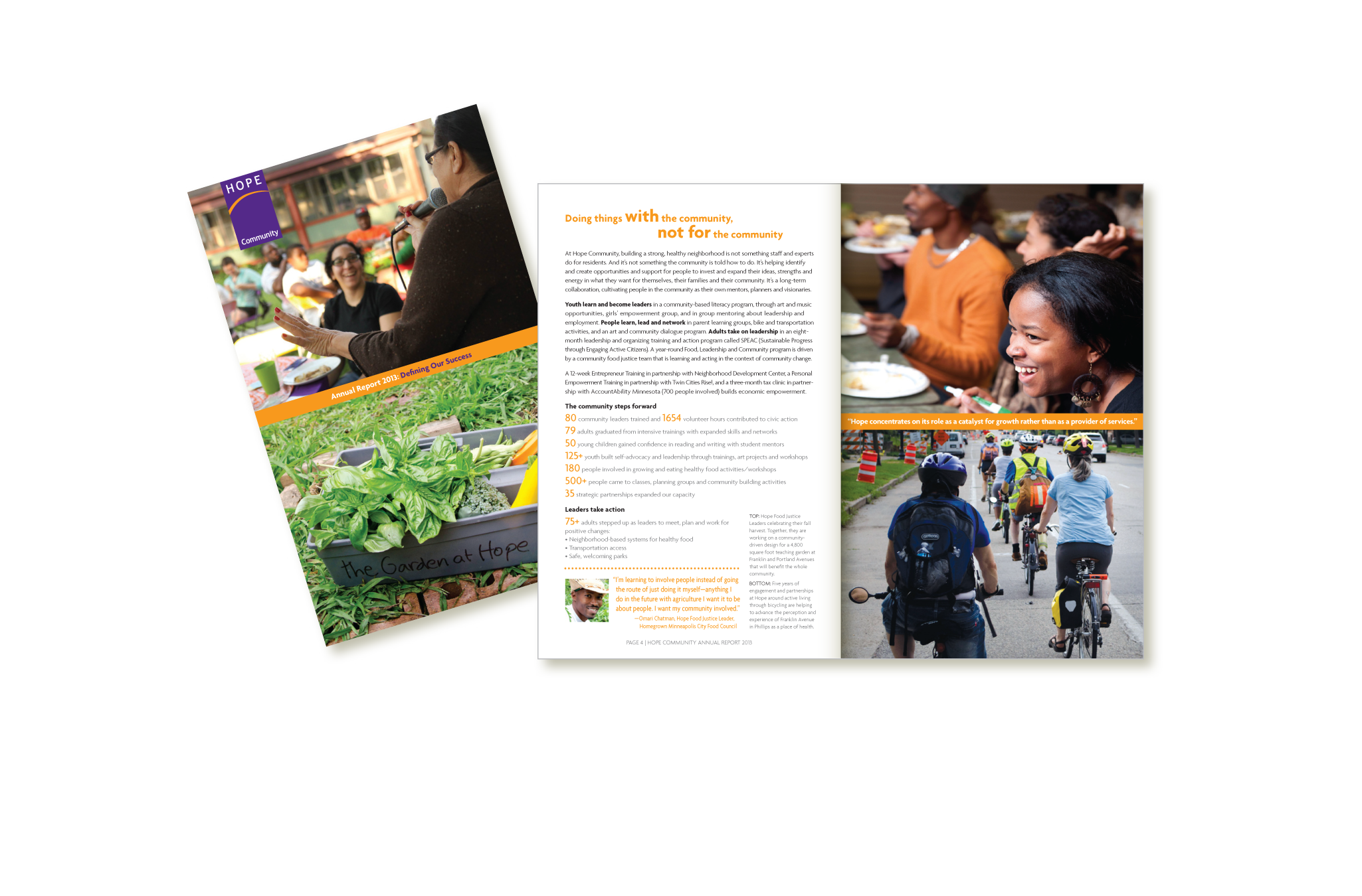
We're delighted that we've also had the chance to continue to tell Hope's remarkable community-building story with our updated branding toolkit in a variety of year-round communications.
