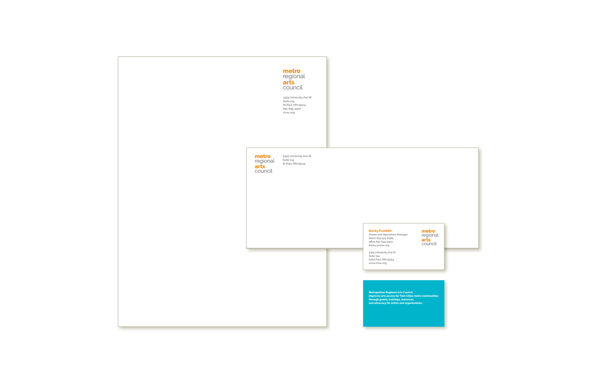
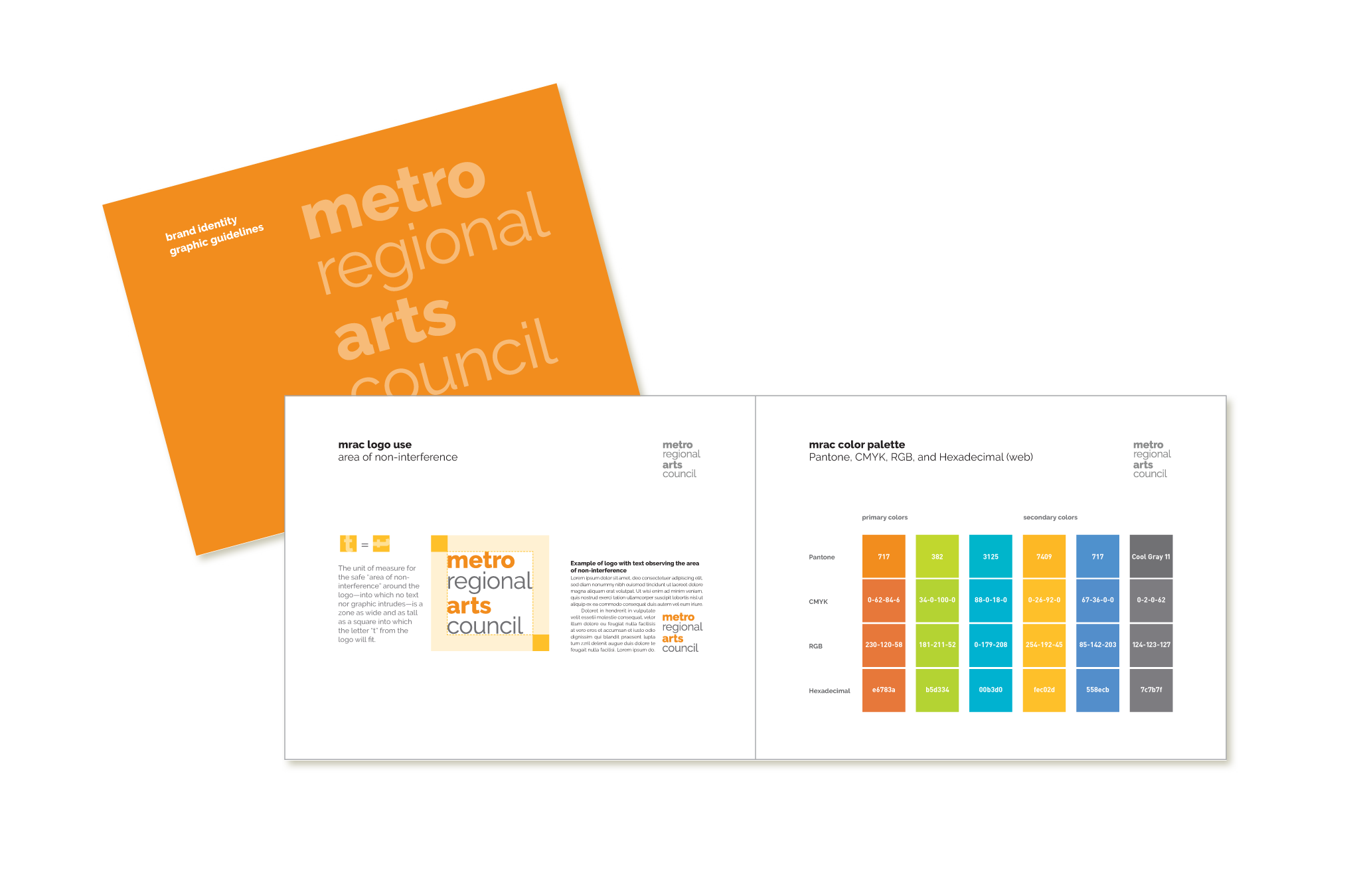
We were delighted when MRAC's communications director contacted us to discuss creating a new identity for them. They serve a huge number of arts organizations throughout the metro region, and they are among their clients' most enthusiastic champions. Offering grants, extensive consulting, and advocacy they sought a welcoming, supportive brand personality. We also agreed that by setting "metro" and "arts" in boldface would make the logotype more eye-catching and easy to read. At least as important, that treatment also coins a shorthand version of the name that is commonly used by people in the organization and the community. We completed the redesign with business stationery and a graphic guidelines document.


